MARES
Design concept and redesign of an existing data-curation and visualization platform to support current students, future students, and researchers to benefit from the existing data concerning research projects.
Service
Data Visualization
Collaboration
E.Krapp
M.Mehreen
Software
Adobe XD
Sketch
Invision App
Year
2019

Design Methodology
To start the project, we conducted a literature review to gain an understanding of the concepts of data curation and visualization. Our goal was to identify existing practices, needs, and research gaps in these areas. Additionally, we conducted brief interviews to determine users' needs and develop the data visualization concept. Finally, we created a prototype and tested it with users to refine the design.

Figure 1: Design methodology for the data visualization concept.

Content Inventory
Familiarize
with data
Parallel to conducting a literature review and engaging in reflective activities, it was necessary to familiarize ourselves with the selected project data and repository. To this end, a content inventory was constructed to understand the scope of the dataset and the current structure of the repository.
However, the current repository is only understandable to users who are already intimately familiar with the data. The amount of semi-organized data is overwhelming and disorienting, making it difficult and time-intensive to explore.
As a result, the current repository is unsuitable for accessing second-hand data
Interviews-auto-ethnographic reflections
Informal Interviews
To identify gaps in existing data curation approaches, we conducted informal interviews and auto-ethnographic reflections. The informal interviews were carried out with a small sample of fellow students from various academic backgrounds in Software Engineering, Design, and Media Communication.

Design Concept
Data Curation Concept
An “Iceberg” metaphor was derived from the need to explore the data from an overview, moving through more general information into specific files. This metaphor guided our curation of data to ensure a natural usage flow that familiarizes the user with the project data without being overwhelming.
In keeping with the “Iceberg” metaphor in the Design Concept, the user should be guided into the project data starting at the “tip of the iceberg”, which concerns only the most important cornerstones of the project.
The user then “snorkels” into an introduction of the project. Once the user has gained an understanding of the project, they take the “deep dive”, moving in a structured way into the raw data. This metaphor guided our curation of data to ensure a natural usage flow that familiarizes the user with the project data without being overwhelming.

Figure 2: Data Curation "Iceberg" Concept
Design Concept & Design Evaluation
Data Visualization Concept and Cooperative Evaluation
The Design Visualization Concept (Wireframes) and an Invision semi-functional prototype were created in order to test the prototype. A Cooperative Evaluation framework was chosen, as this enables identifying the most pressing issues with minimal resources. Considering the limited timeframe of the project, the flexibility and expressiveness of this usability testing approach proved to be the most useful and effective to task the most critical use cases and the Iceberg metaphor.
Wireframes for the creation of the prototype.

Final Concept


Describe your image

Describe your image


Describe your image
DESIGN
IMPROVEMENTS
01
Aesthetic and minimalist design
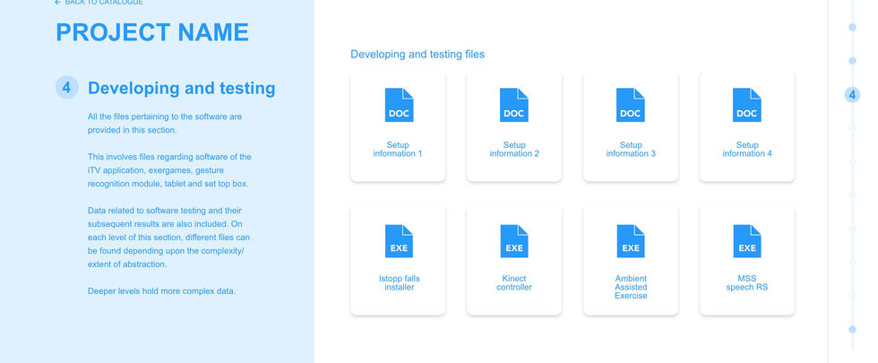
On the first version of Mares a blue color palette was predominant in the design, which resulted in confusion on the user regarding clickable options on the screen. Changing the design to a more minimalistic approach and showing a clear call to action, buttons, and links, we can diminish the error of confusion and just provide the right and relevant information to the user.
03
Flexibility and efficiency of use
The lateral menu screen showing the data complexity will allow the user to navigate, section by section by simply selecting each one, or via scroll down, providing alternatives to discover the interface and move around the desired data efficiently and fast.
02
Consistency and standards
Most of the problems found in the original design were the lack of consistency, the secondary bottom menu that appears and disappears according to the level of complexity. So in the new version on Mares, the secondary menu will be eliminated. There will be only two menu navigation, primary navigation that shows the logo, profile view, and most important sections, and the secondary menu, a lateral bar that will show “the levels” of complexity and files.
04
User control and freedom
Proving a clear menu of navigation and the functions to go easily go back to the project catalog, quickly change between views and accessing the main navigation tap with sections, supporting user actions and giving the freedom to undo and redo actions.


